Case study
Labora
A website for an events-staffing company, built to convince clients at first glance.
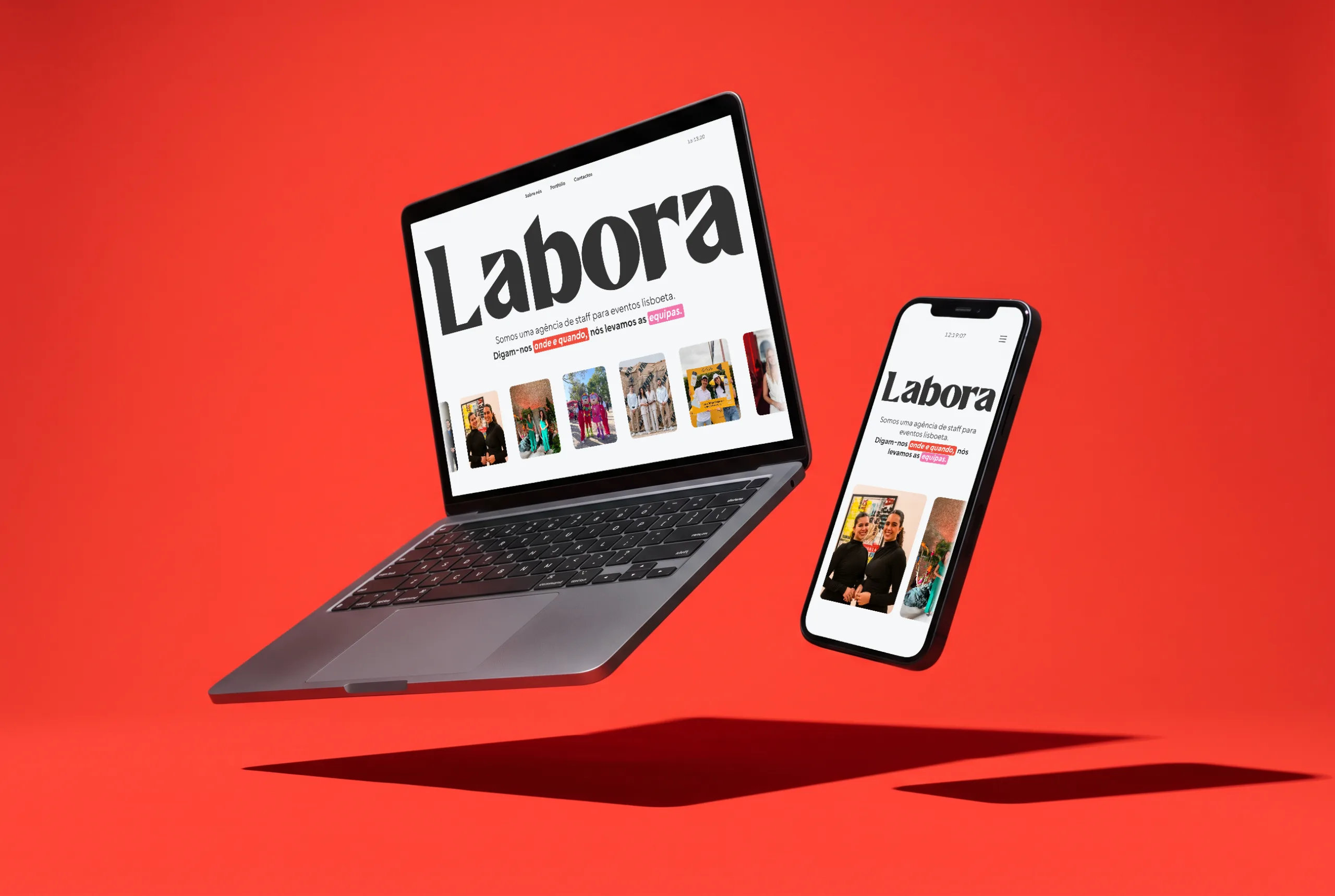
How can we stand out?
In event staffing, most companies offer the same service with the same faces, so flexibility is what sets one apart. Labora’s identity is built around saying yes to any challenge, but without a website that showed that straight away, they risked being overlooked before a conversation even started.
Finding the real entry point
Having worked in the industry, I knew most staffing companies rely on personal contacts, and studying competitors’ websites showed they are used only as directories. The questionnaires told me most clients want a fast, reliable service and need to get that impression immediately. So the website had to convince them on the first screen.

Three decisions that did the convincing
01Straight-to-the-point landing page
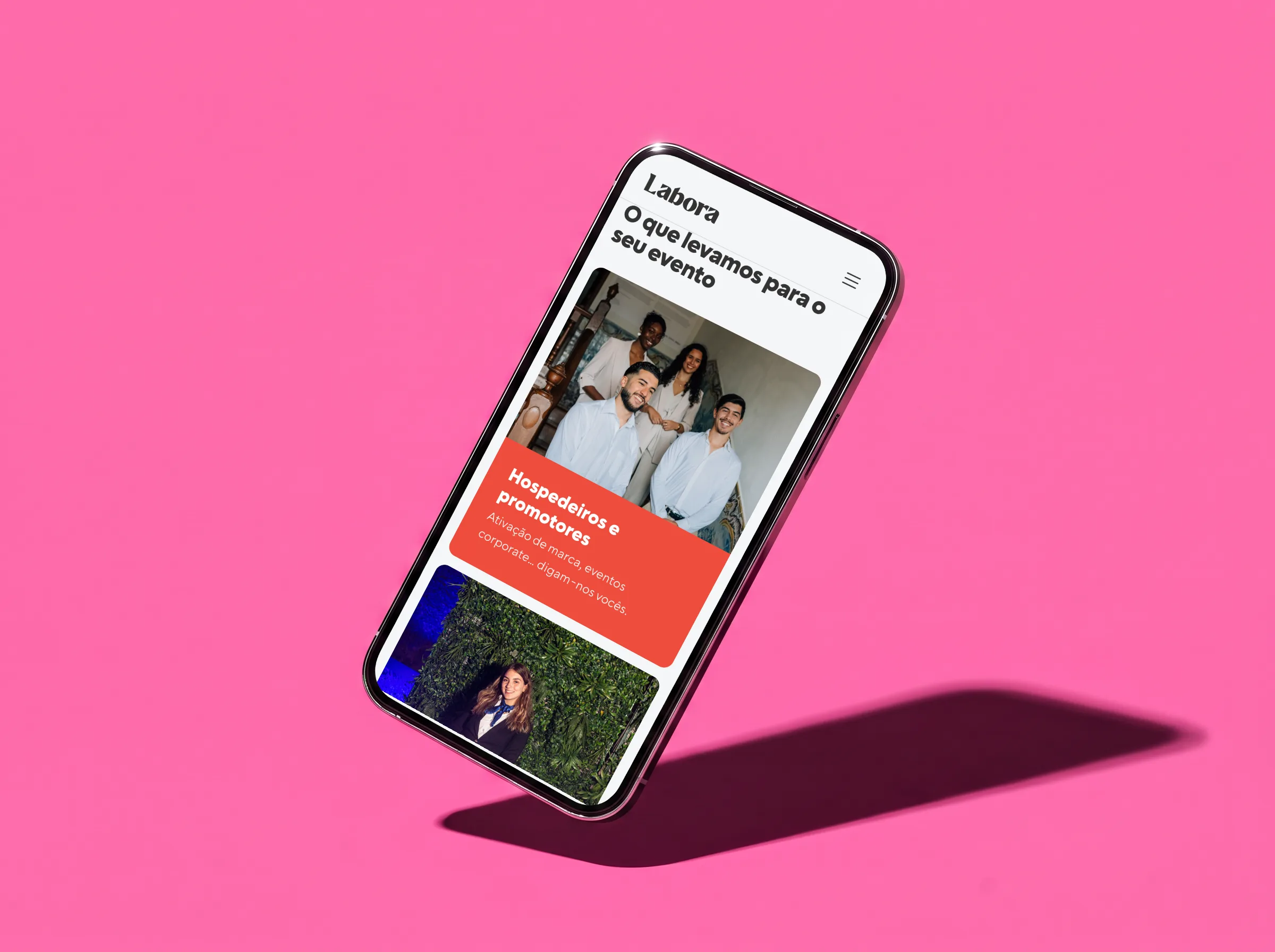
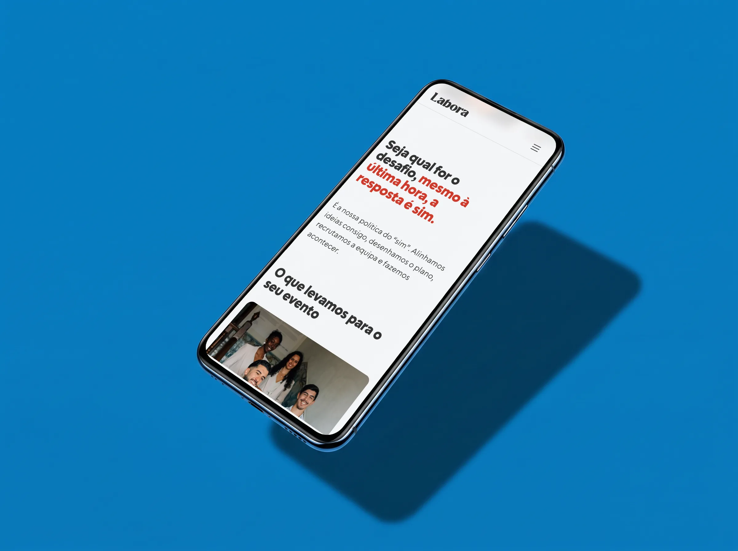
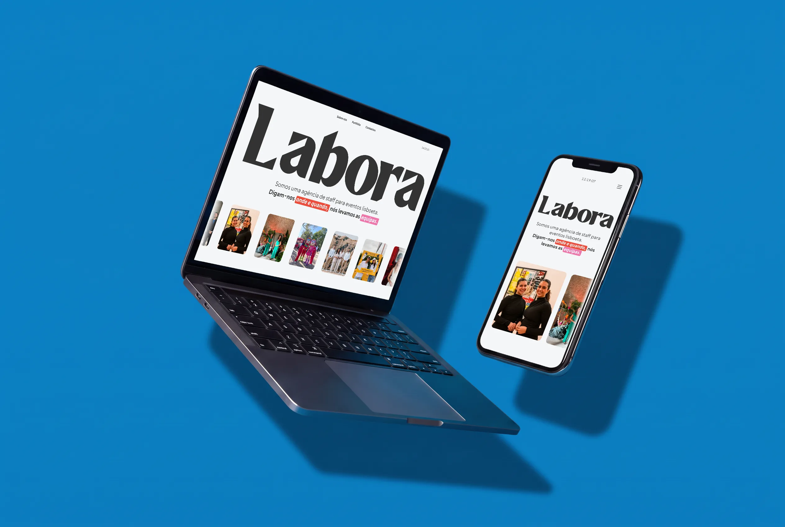
The landing page puts the company’s core values up front, so people don’t have to look for them. I kept it to a single screen with no scroll, so the brand’s identity is what people remember.
02Motion as brand language
The content on the landing page came from the questionnaire answers. To help people get to know the brand from it, I designed motion and type effects that show Labora’s adaptability, speed and character, so people get a feel for working with Labora without looking any further.
03Built on what we found
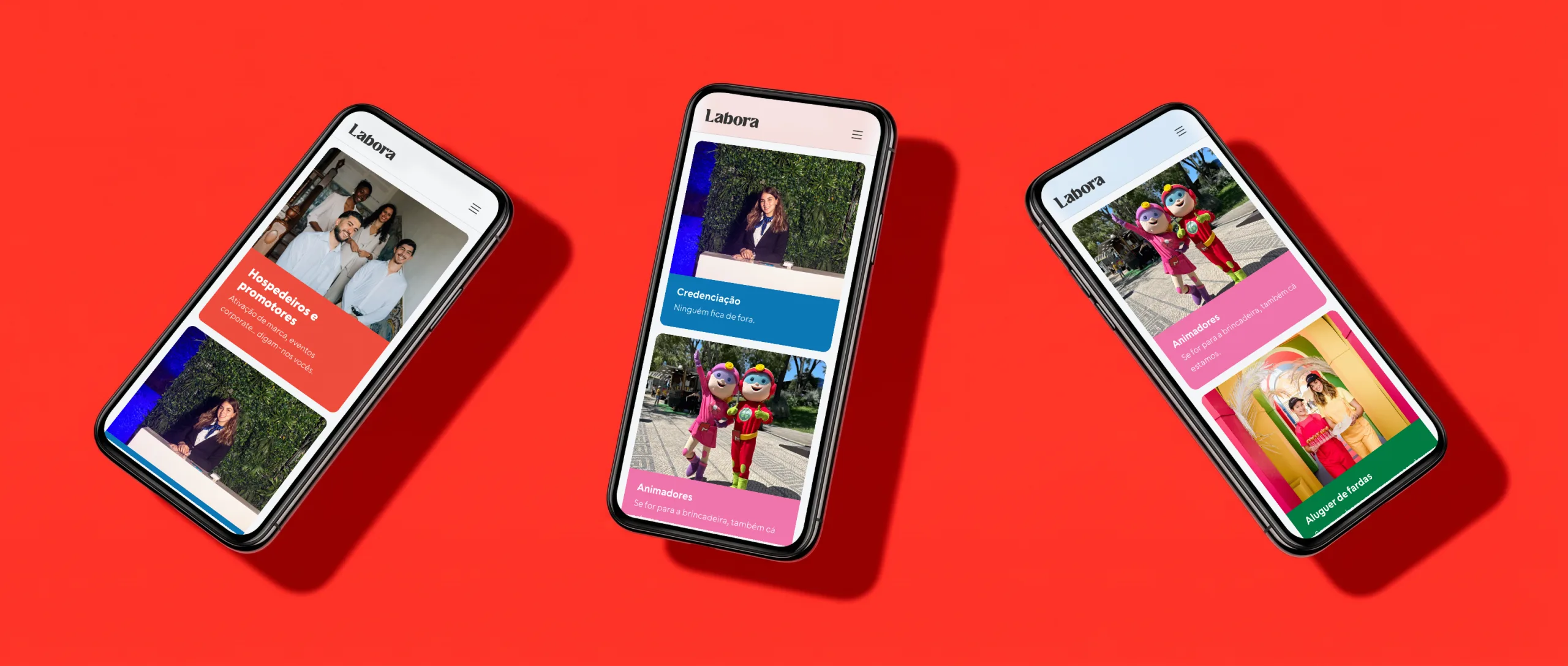
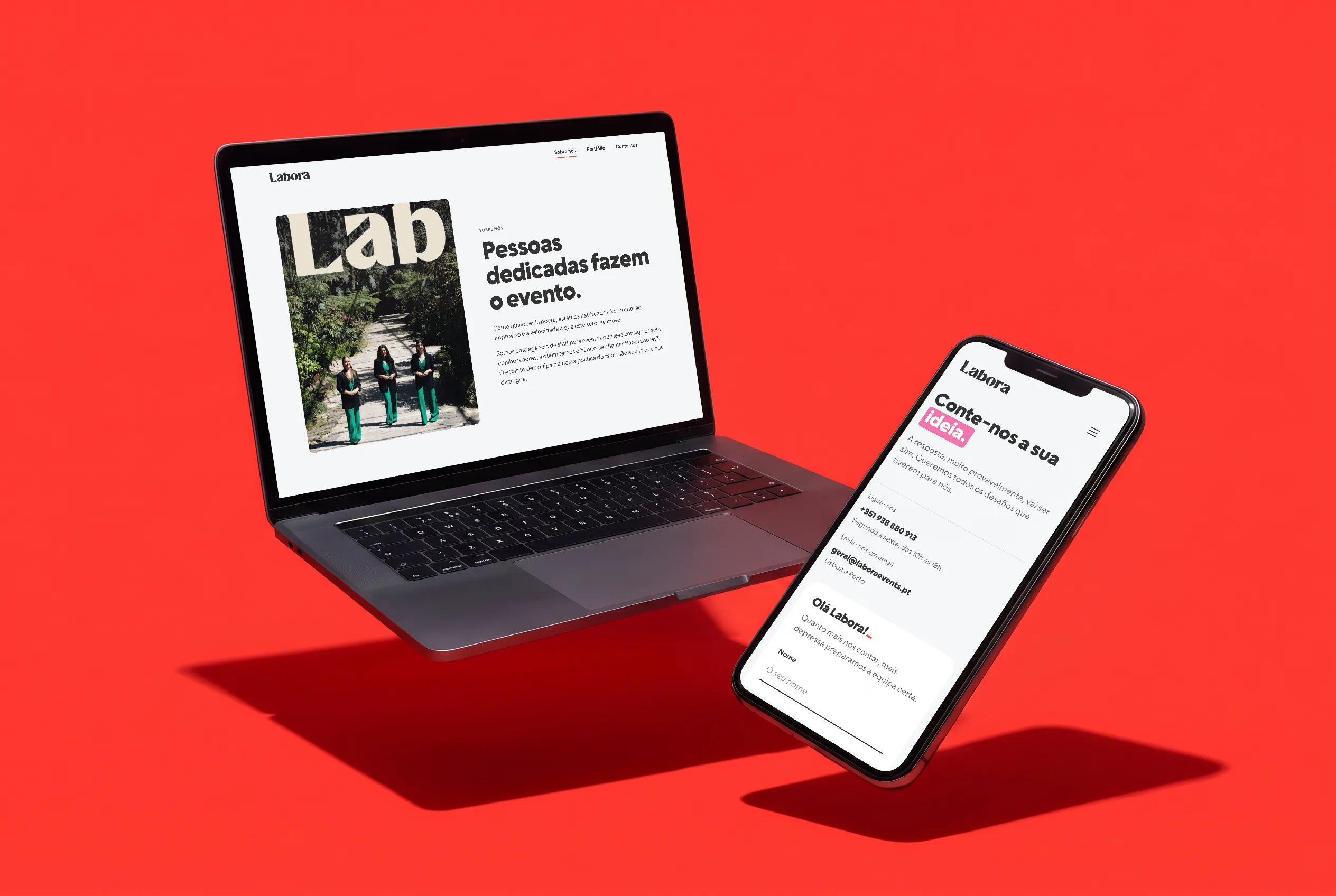
The information architecture follows what people needed. They wanted an easy way to reach the company, so contact gets its own page and a clear call to action. They wanted to understand the services, so those are animated into the landing page and echoed in About. To avoid feeling like a directory, I leaned into what competitors weren’t doing: people wanted warmth and to know who’s behind the company, so About opens with the team. And they needed proof, so there’s a dedicated projects page.
What changed
I couldn’t track measurable results after the project ended, but the website gave the client something that raised their confidence when pitching to new clients. For me, this project shaped how I approach clients, manage projects and set boundaries.
A lesson learned the hard way
In the early days, I put client approval ahead of the boundaries I should have set, and the quality of my work suffered. I didn’t yet have the experience to estimate accurately, or the confidence to protect the timeline when things slipped. Parts of the design process, the wireframing especially, were sometimes skipped, which led to redesigns on top of redesigns because work hadn’t been approved first.
Now I set the process and timeline upfront and walk clients through each step, so they understand why each one takes the time it does.
Got something in mind? Tell me about it.
- 30 minutes. You tell me what you’re building, and I ask a lot of questions.
- You leave with a clearer next step, whether we work together or not.