Case study
Nutrition practice
An all-in-one platform for a women’s health nutritionist and her patients, built so nothing gets lost between consultations.
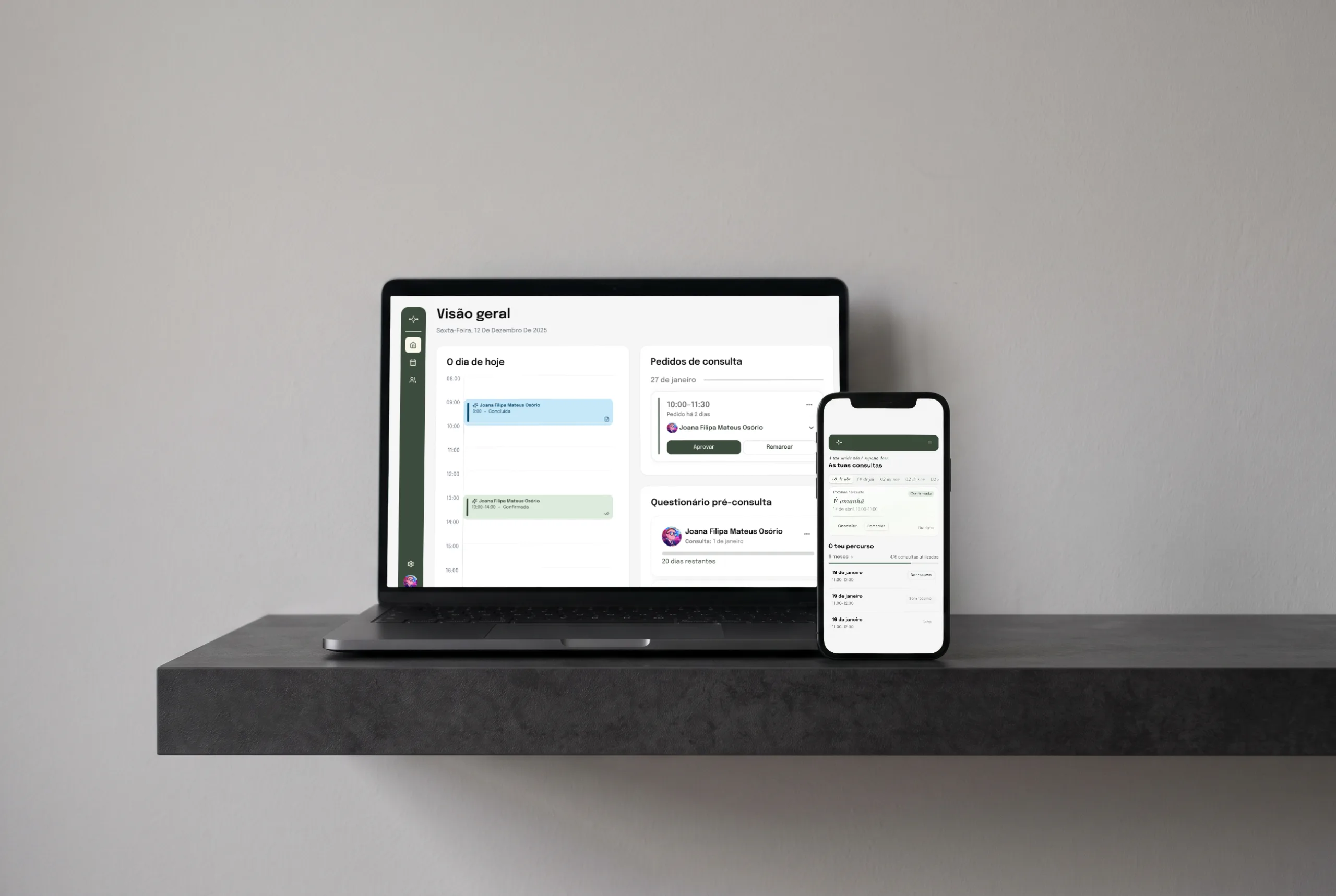
Everything had its own place
The client, a nutritionist, ran her practice across a handful of tools. One listed her patients and booked appointments; notes, payments and documents each lived somewhere else. It was hard to keep track of appointments and where each patient stood, and her notes sat apart from the person they were about. Her patients felt it too: paying took extra steps, and every plan or document meant digging through their email. She wanted one place to find and record everything.
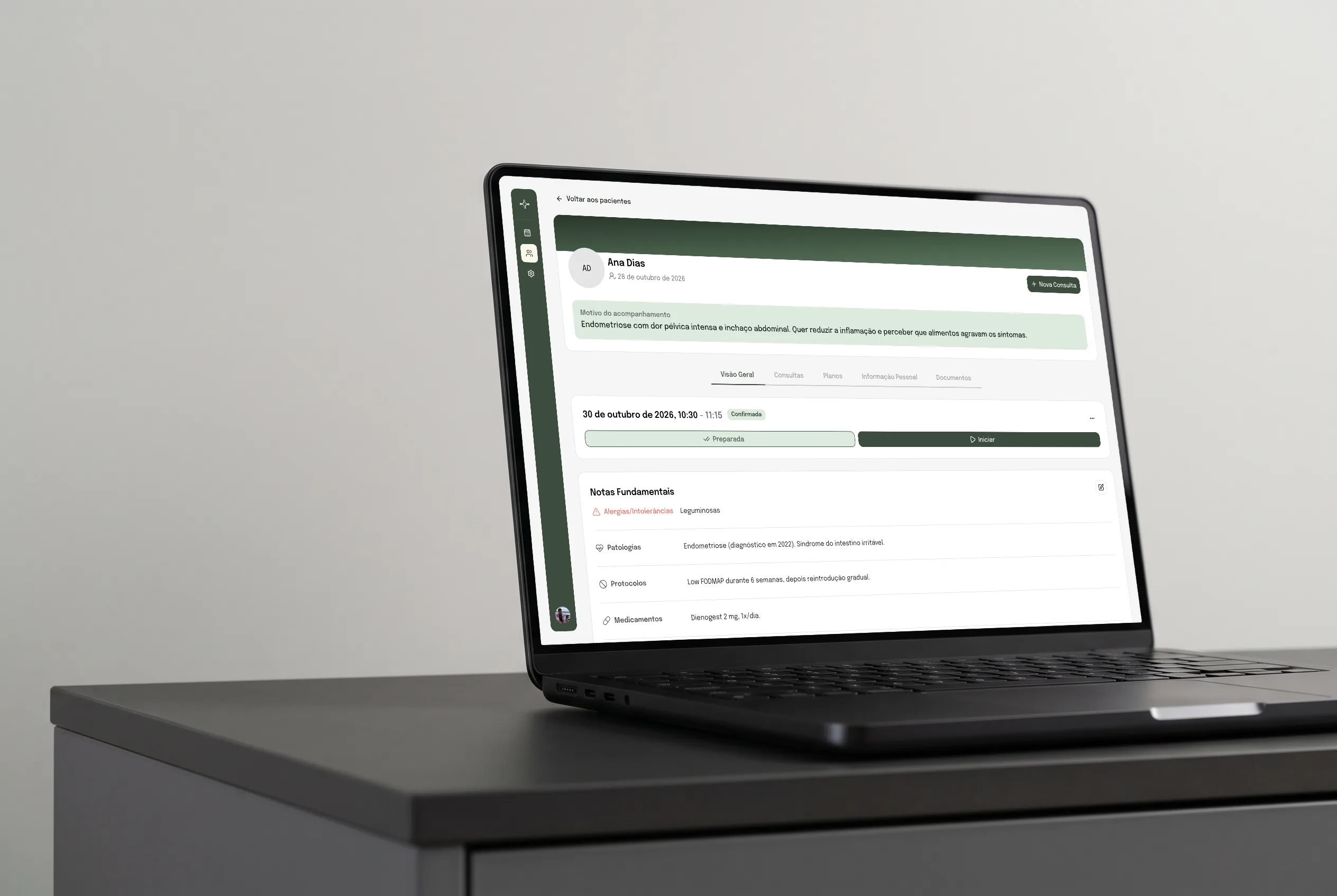
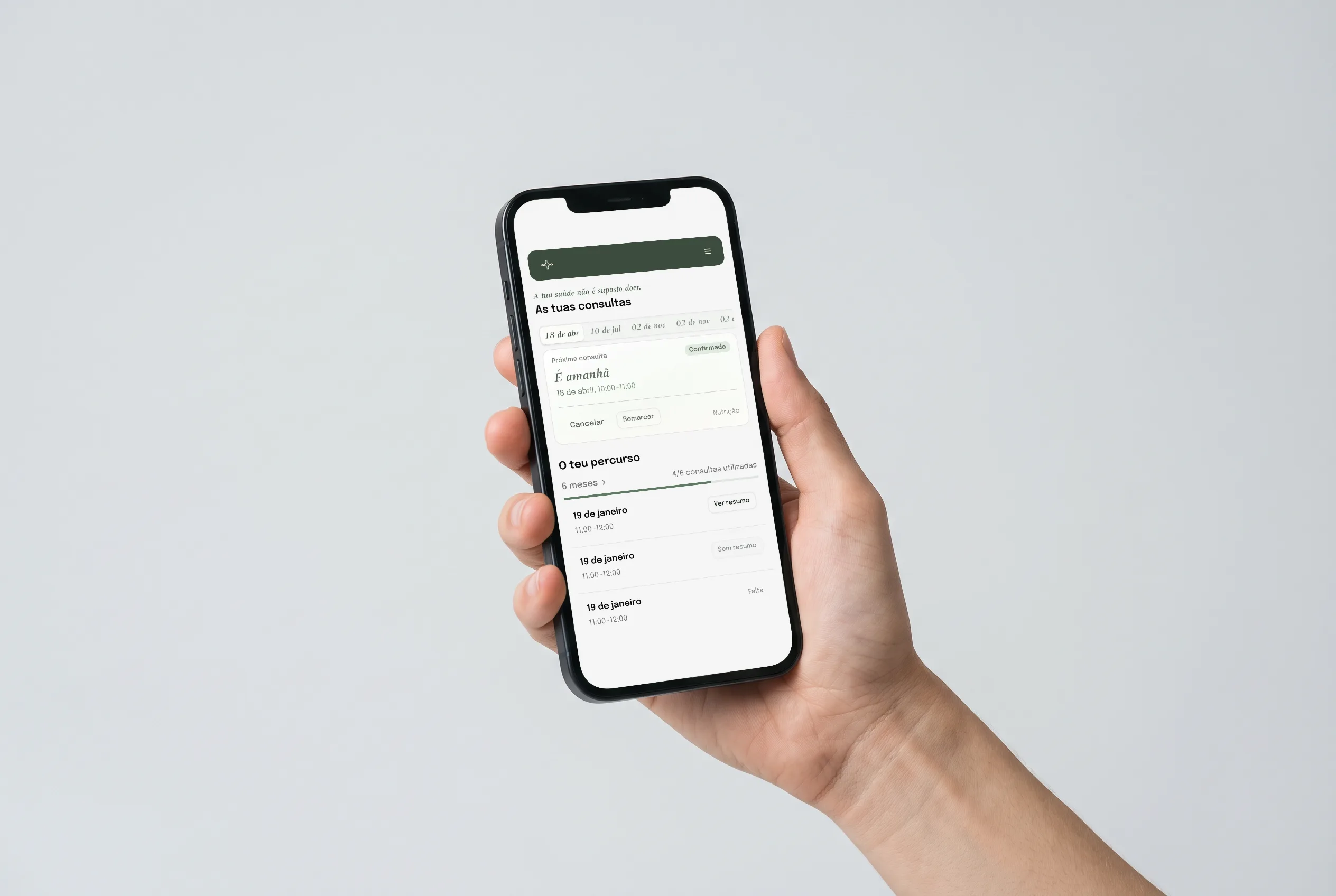
Before, during and after
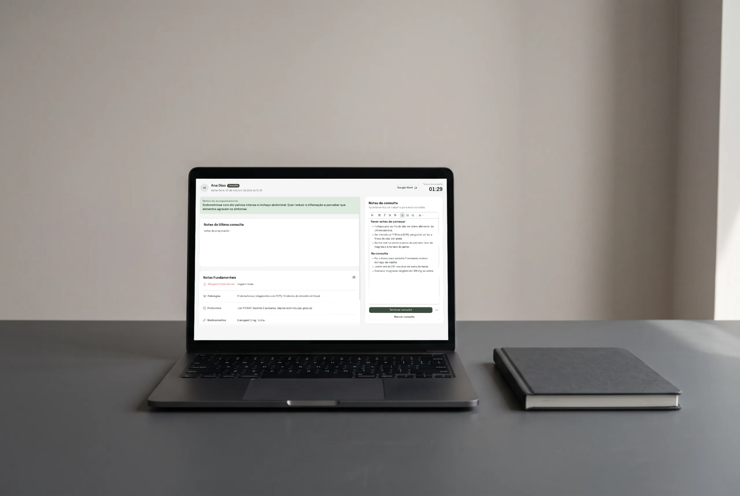
The pieces she needed already existed. The hard part was fitting them into one place. I started by learning how her practice works: how she approaches her patients, the path a patient takes, and the work that path creates for her. Then I mapped what she does before, during and after each consultation, and how those tasks could connect to save her as much time as possible.
Along the way I learned how wide her care reaches. It covers so many parts of a person’s life that calories and macros barely matter, so the product never puts them up front. She needs a lot of information at hand at all times, so most of the work went into the hierarchy: the most important thing always has to be the easiest to find. Resources were limited, so we cut the first version down to what matters most and left the rest for later. She has stayed close the whole way. We meet every week, and she follows the work as the developer and I build it, giving her view on each step.
Three decisions that hold it together
01One continuous flow
Buying a pack, booking, the first questionnaire, the consultation, the plan, the next booking: each step leads straight into the next, inside one product. She and her patients always know where they are and what comes next.
02Prepare, then consult
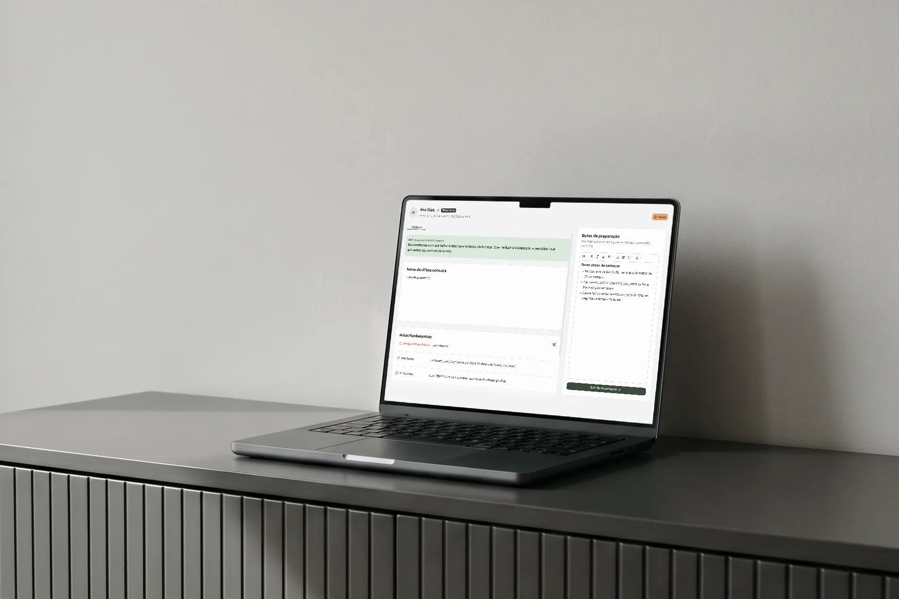
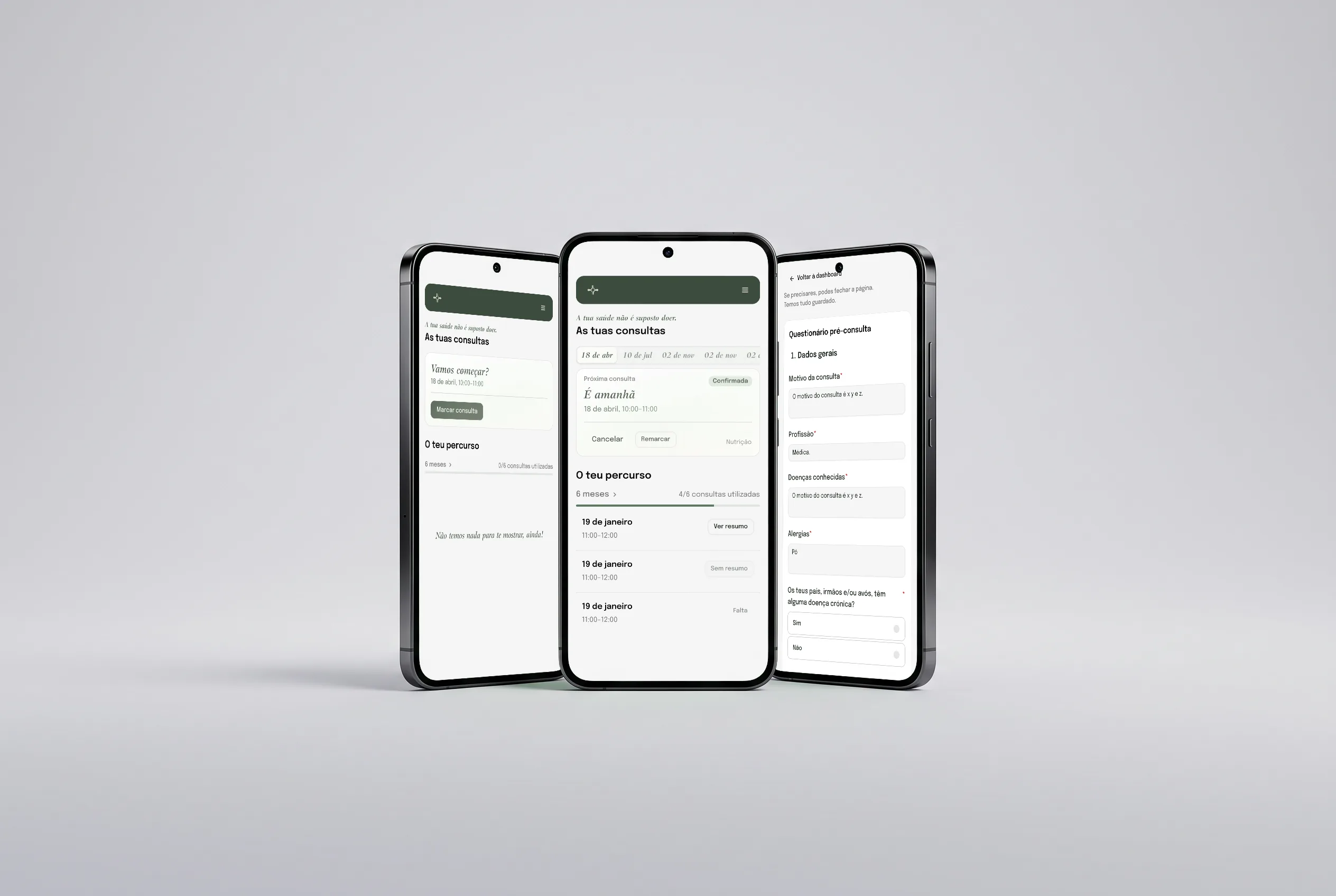
The nutritionist prepares each consultation ahead of time, and if a patient misses it, the preparation is kept for the next one. Her appointments put “Prepare” first, then switch to “Start” thirty minutes before. During the consultation, her private notes stay apart from the summary the patient receives, and everything saves on its own when she leaves.
03One record, two views
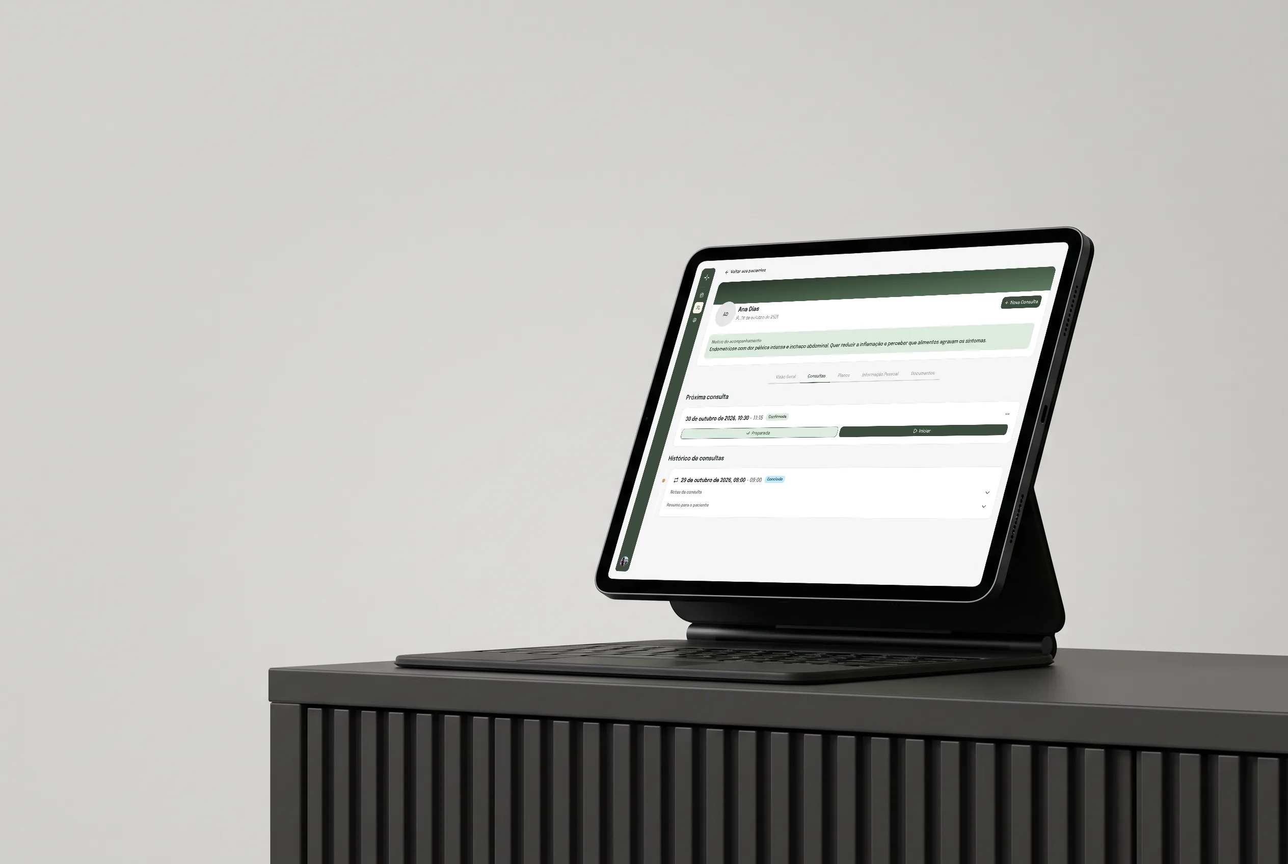
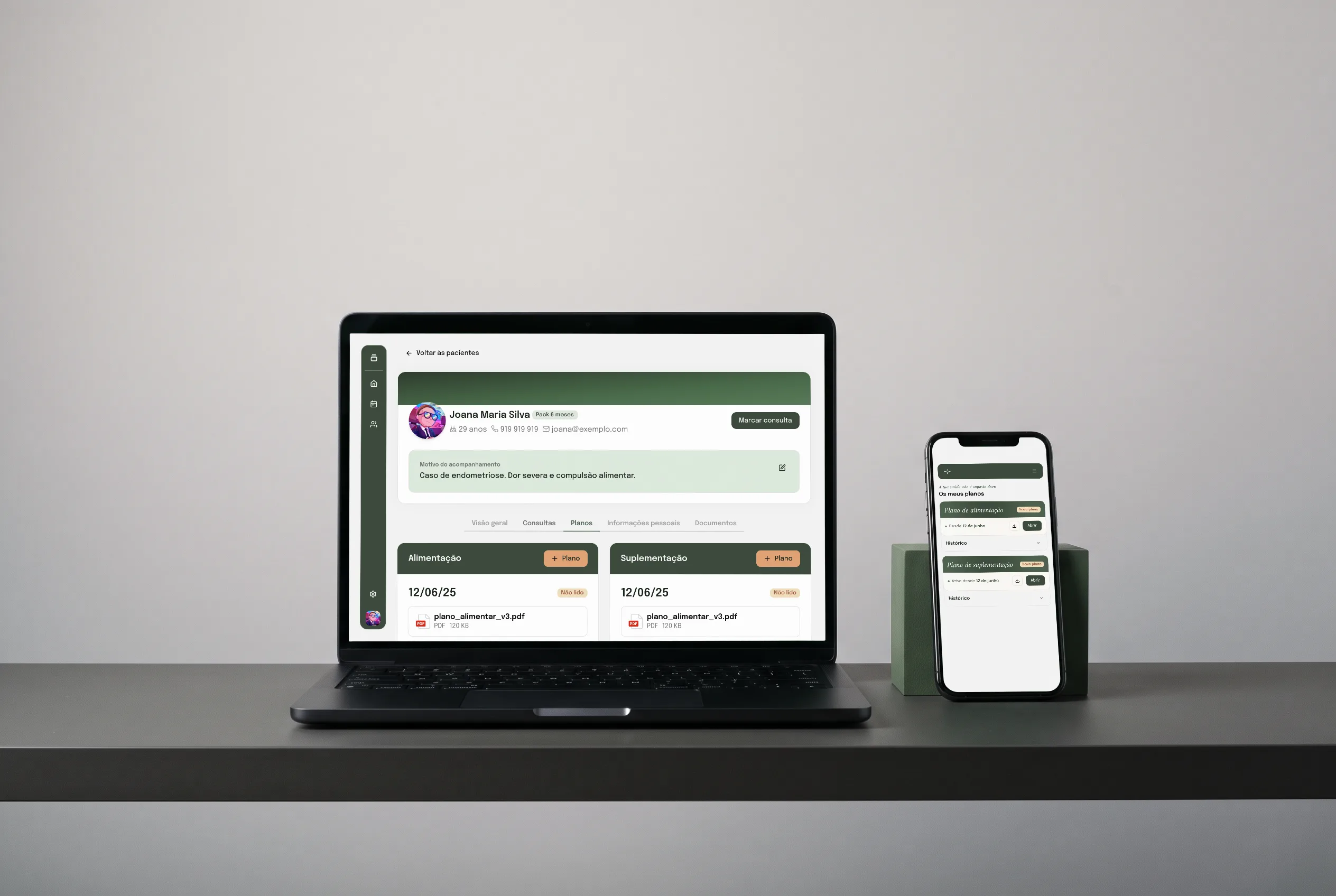
The nutritionist and her patients look at the same information, each in their own way. When she uploads a plan, it appears on the patient’s side. When a patient pays or sends a document, it lands on their profile on hers. Her side is built for running a practice from a desktop; theirs is built for what patients need to do on their phones, with the main actions always on screen.
Going live in early 2027
The platform goes live early next year, and feedback from the nutritionist and her patients will show what’s working. The first addition after launch is progress tracking. It follows the answers to the first questionnaire and every check-in after it, so she and her patients can both see how pain and other symptoms change over time. Other features will come after that, one at a time.
Know the work before designing for it
The solutions only came once I fully understood her field and how she works, step by step. Without that understanding I would have ended up with a generic tool. The project also showed me how much depends on feedback from real people. Every assumption needs checking with the people who will use the product, and the next step is doing that with her patients. Keeping a record of every decision and iteration helped, because I could always look back at what was asked for and why things changed.
Above all, it confirmed my strongest belief about design: hierarchy comes first, because people need to be guided.
Got something in mind? Tell me about it.
- 30 minutes. You tell me what you’re building, and I ask a lot of questions.
- You leave with a clearer next step, whether we work together or not.